Role: UX Research in a team of 3
Tools: Figma, SketchUp, Enscape
Timeline: June - July 2021
ShopLift
RESEARCH
The ShopLift Team was approached by Woolworths to create a virtual version of their live stores to enhance their online shopping platforms. In light of the Covid-19 pandemic many people have been restricted to their households and have come to miss the feeling and experience of being in a brick-and-mortar store environment. ShopLift VR solves this problem by having users interact with products in-store and giving them full access across the store floor.
Problem
People have been put on lockdown at the risk of Covid-19 spreading. Having been restricted to their household, the food is running low but no one wants to go outside and risk getting infected
Design Frame
How might we create a personalized shopping experience for people in lockdown during Covid-19 to reduce the stress of having to buy groceries by using virtual reality?
User Survey

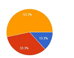
Do you know what Virtual Reality is?
Have you used a VR Headset before?


How do you use Virtual Reality?
How would you describe Virtual Reality?


Conducting a survey on people's general experience with Virtual Reality helped to set the tone for how users feel about using this technology to do their shopping. The majority of answers show that not many people own a VR headset yet so their experience is limited. The general feedback from trying virtual reality is overwhelmingly positive
MOODBOARD
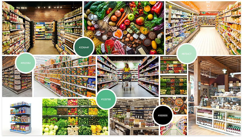
We chose to create a retail virtual reality experience, allowing users to buy groceries and get them delivered. Multiple mood boards were created to inspire our color scheme and store layout. When we were introduced to VR, it helped us visualize ideas of how the final store would look and function.

USER PERSONA
The persona was created and updated. The persona allows us to determine exactly who our target audience is and what traits they have, what are their goals and frustrations. The sooner we know what our users want the better the solutions to their problems will be.

USER jOURNEY mAP

STORYBOARDS
Before going into VR the user is sick and has to self-quarantine, looking for an online way to buy food, The second is during VR where the user explores the virtual shopping center. Browsing products virtually and then doing the grocery shopping from the comfort of their couch.


Planning
Wireframes
By doing sketches and digital wireframes we give ourselves room to improve while creating iterations. Different stages of the application are visualized to better understand the steps and stages. Any open white spaces will be filled with appropriate items that the user has selected. Black open spaces will have 3D product images hover, this will allow the flat screen to have elements that pop out toward the user.


Final Design
VIRTUAL REALITY
BROWSE STORE
When browsing our virtual store the products can be interacted with on a totally different level. Food can be thrown around, boxes can be open, chaos can reign in the store and it won't matter because all the items will just reappear on the shelves. The only food that gets put into the shopping cart has an impact on the user's shopping list

CONTROLLER LAYOUT
The VR remotes have certain commands connected to the buttons. The standard buttons are used to grab and move items. A is used to open the main menu to selected food types, and B is used to bring up item information when holding something. Y is used to go back to previous screens and X is used to complete purchases and get taken to the checkout

MAIN MENU
When you have entered the store you are greeted with the main menu where you can select to be teleported to the food isle of your choice. The store can also be explored by moving around manually. The menu has 3D elements of products. The user will push a trolley where ever they go like in the real world.

CHECKOUT PROCESS
When done shopping you are taken to the checkout page to edit or remove items. The mobile app needs to be linked that the order can be tracked and payment information is easy to access, it also allows the user to confirm orders. Once order is confirmed, money will be deducted and the user is presented with a thank you screen
